Seattle Psy Ops
This design was created from scratch to revitalize the image an already successful organization and introduce it to an expanding audience. Not-so-subtle nods to sacred geometry and psychedelic imagery speak well to the fan base of these electronic dance music event promoters.
A suite of logo options was created for use in different contexts, with further versioning for placement on light and dark backgrounds. This flexibility allows for easy incorporation into any campaign design.
Seahoma Records
Brand development for this startup project is currently still in progress. The initial soundwave "S" mark is being examined for sub-branding for 3 divisions of operation: music label, lifestyle store, and creative services.
The 3D treatment has become a generic brand logo which performs well on social media as a profile image.
Legion Air
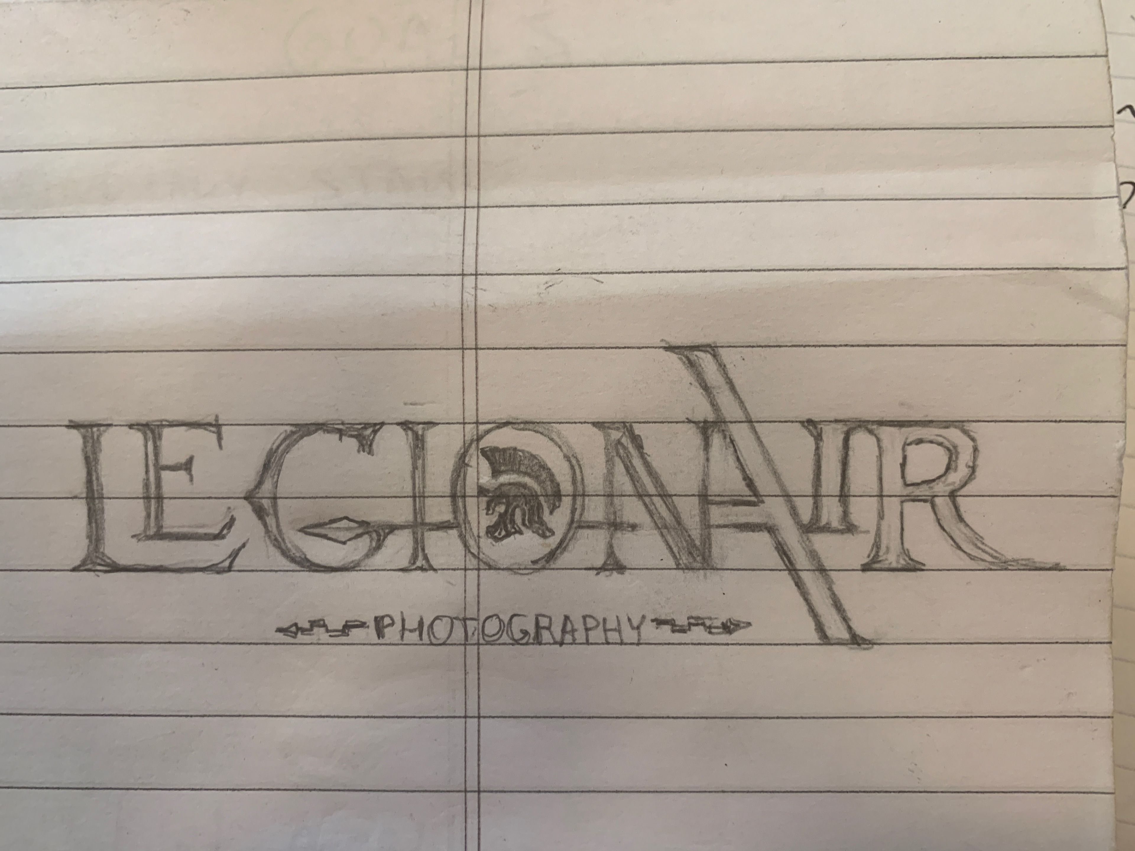
A professional drone operator came to me with a sketch and a vision for his startup company. This is how his idea was transformed. The bold yet basic color scheme of blue, red, and gold communicates trustworthiness and authority. We agreed to keep "photography" or "aerial video capture" out of the final logo to keep the mark clean draw as much focus to the brand as possible.

